First impressions are important. That’s why it’s essential to keep up with the latest logo trends to ensure your personal or business branding always looks fresh.
Whether you are a designer working on client projects or a small business owner who’s keen to take control of your company’s visual identity, we can help you find the right template quickly to kickstart your creativity.
1. Flat Design Logos
Forget intricate illustrations and all-singing, all-dancing animations—design is dialing things back with this simplified aesthetic. Doing away with three-dimensional realism, textures, shadows, gradients, and all other embellishments, the result is a two-dimensional logo that looks, well, flat.

One brand that’s successfully focusing on the bare essentials is Durex. Showcasing a new, bespoke typeface, its redesigned logo maintains the lozenge shape—aiding recognition—while ditching the light flare and convex, reflective style. Embrace minimalism and get straight to the point with our easy-to-edit, customizable News Logo Template. And, when it comes to finding fonts to fit your brief, our video guide to the 10 most popular fonts can help.
2. Animated Logos
On the flipside, there are plenty of advantages to animated logos. Visuals with multiple moving parts attract attention, can make a brand more memorable to consumers, and offer up storytelling opportunities. As a result, this year will see designers take an increasingly playful approach to dynamic details while making animations more elaborate and artistic.

Look at the New York City Ballet’s logo, which sees the city skyline morph into dancers’ en pointe feet. It gives a sense of place while establishing that dance is literally written into the organization’s DNA—all in under two seconds. Envato Elements is home to thousands of animated logo stings, like Premiumilk’s Animation Revealer, which sees random shapes and swirls morph into a brand name and logo.
3. Hand-Drawn Logos
Luxury fashion and super-slick styling go hand in hand. So when Gucci revealed a scrawled logo and a series of handwritten messages to announce the launch of its Fall-Winter 2020 Men’s Collection, it caused a social media sensation. Publishing a series of Facebook posts featuring mismatched character sizes, wobbly lines and ink blots might seem like an odd choice, but for a campaign that’s inspired by children’s birthday parties, this amateur aesthetic might well be a masterstroke.
In an age when brands want to demonstrate their authenticity and down-to-earth approach, handwriting seems like the obvious choice. Thankfully, this hastily sketched style is easy to emulate with editable templates featuring a range of strokes.
4. Minimal Logos
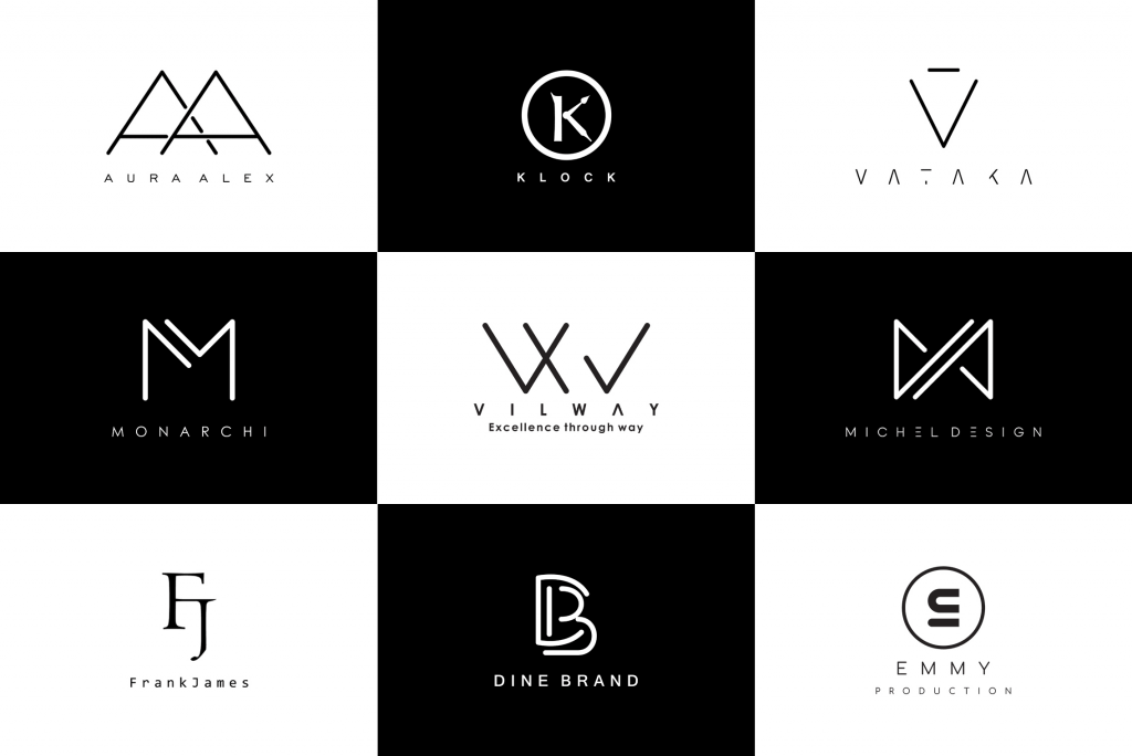
In a bid to cut through online clutter, minimalism has been making waves for a while now. As a visual embodiment of the ‘less is more’ mantra, the idea is to avoid decorative flourishes and unnecessary detail. Take BT’s new logo reveal, which represented a sparser, simpler version of what has gone before. Rather than trying to encapsulate everything the business does, designers opted for a bold monogram because really the name of the brand is all that matters.

Whether it’s for a personal project or a business website, minimal logos can work just as hard as more complex creations, so check out hundreds of templates that get straight to the point.
5. Multi-Layered Logos
Flat design logos might be having a moment, but designers still have a love of layering, which means we are seeing lots of overlapping elements. Vibrant colors, highlights, shadows, shading and semi-transparent treatments can all play a huge part in the creation of a multi-layered logo, which is why graphic templates from the likes of Sentavio are proving so popular. Available via Envato Elements, every layered letter of the alphabet is created from 100% vector shapes and is fully customizable.

Look around and you’ll see this trend being put to good use everywhere—from understated examples like fashion retailer Zara’s decision to close the spacing between its letters to standalone heroes like Mastercard, which recently dropped its brand name from beneath its intersecting red and yellow circles.
6. Stacked Text Logos
What happens when old-school brands want a logo overhaul? They opt for stacked text. Well, that’s if recent reveals by US department store Lord & Taylor (first opened in 1826) and management consulting firm McKinsey & Company (established 1926) are anything to go by. A clean and compact approach that’s perfectly suited to long names, this space-saving solution can also be used on individual letters and in horizontal orientations as well as landscape.
Envato community member Anantasteyr has developed a stacked text logo template that’s ideally suited to plumbing businesses, while thousands of other options that are suitable for a range of professions can be found on Envato Elements.
7. Monogram Logos
What do Yves Saint Laurent, Hewlett-Packard, and Warner Bros. have in common? They are all brands that are instantly recognizable by the letters in their logos. Instead of creating an abstract symbol, designers combine the initials of a person or business (with or without imagery) to create a bold brand identity.
The monogram approach can also take something that’s a mouthful (we’re looking at you, Minnesota Mining and Manufacturing Company) and make it better (3M). Coming up with your very own YSL, HP or WB isn’t difficult thanks to our customizable templates, like this vintage monogram by VisualColony.

8. Symbol Logos
If an alien landed tomorrow, they might describe Airbnb and Nike’s logos as an ‘A’ and a ‘tick’ respectively. But you only have to inhabit Earth for a few minutes to realize they are in fact a ‘bélo’ and a ‘swoosh’. Such is the power of a strong standalone symbol. And because symbols are (cough) symbolic, they represent an incredible opportunity to sum up what a brand is all about. That’s why Slack’s just-launched logo features speech bubbles, the acronym NASA is surrounded by stars, and the state of Colorado’s colorful new offering combines trees and mountains.
9. Gradient Logos

Whether a design spans the entire visible spectrum or simply features one hue that fades to white, gradient logos are throwing some serious shade on their single-color counterparts. You only need to look at the eye-candy appeal of Instagram, iTunes and Tinder’s logos to see that it’s a trend that’s making millennials swipe right on these brands.
This year, we expect to see designers increasingly using gradients to add depth and create a dynamic, 3D feel. Featuring just three soaring shapes is brought to life with the use of pastel color progressions.
10. Vintage Logos
Time for a healthy dose of nostalgia. It doesn’t matter what decade you grew up in, designers are clearly yearning for yesteryear. We are seeing craft beer brands launching their own riff on 1930s-style comic books and cartoons, coffee shops opting for retro chalkboard-inspired typography, and small businesses conveying a sense of authenticity with 1950s badges and buttons.


